

The images, signs and logos that have shaped the history of Bovisa and of today’s Goccia have never ceased to exist in a complex relationship with the centre of Milan. It is a long story, one that begins far back in time.
In May 1946, just one year after Liberation, the city is portrayed in the pages of Il Politecnico, edited by Elio Vittorini, as a place inhabited by ghosts. In an article written by the young Luigi Crocenzi, the Lombard capital is described as a riddled body. «That city died»① Crocenzi writes, referring to the wounds of war and to the Galleria Vittorio Emanuele, collapsed under RAF bombing. The still-open scars in the city’s buildings become, in his words, an effective metaphor for the tearing of the soul and the crisis of identity of a city «which perhaps more than any other had believed in the bourgeois eternity of the world, in a slice of panettone for everyone and in the childlike smile of the Madonnina»②.
The Milan described by Crocenzi in the spring of 1946 is a disillusioned city, one that realises too late it had been mistaken in embracing the vision of progress and civilisation promoted by the Fascist Ventennio.
However, the dying Milan Crocenzi looks at is, more specifically, a portion of the city itself: the centre, its beating heart, the stage of bourgeois life and business which, one year after the end of the conflict, appears haunted by the ghosts of a past never truly concluded. «That city died. Yet the ghost still survives; the shadows of all those who profited from its illusions still wander […]. Stubbornly refusing to believe themselves dead, they exchange bows, congratulate one another on their ointments and their uncrushable clothes, and offer each other flowers»③.
Accompanying the article, Crocenzi – who in the years to come would become one of the leading theorists of photographic narration④ – constructs a dense double-page spread of photographs: a mosaic of black-and-white images in which bourgeois, ghostly Milan is narrated through the glitter of shop windows and advertising posters. In doing so, Crocenzi already seems to grasp the risks inherent in the delicate transitional moment Italy was experiencing in the post-war period. Almost anticipating Pasolini’s corsair reflections, he identifies a dangerous shift from Fascist illusion to consumerist promise.
At the same time, as the article is published, the foundations of Italy’s national economic recovery are being laid precisely from the Lombard capital, and the IRI – the Istituto per la Ripresa Industriale – is being consolidated.

Luigi Crocenzi, Occhio su Milano, Il Politecnico, no. 29, 1 May 1946.
Although it does not appear in Crocenzi’s photographic narrative, there is a symbolic place in the city centre, not far from the famous Galleria, that more than any other embodies the transition from Fascist propaganda to the advertising of the subsequent economic boom: Palazzo Carminati. The late nineteenth-century building facing Milan’s Duomo functioned, during the years of the regime, as a platform for Fascist propaganda. In a photograph from the late 1920s, a three-storey archigrafia can be seen anchored to the façade, bearing the three letters of the word «DVX» in monumental Roman capitals. Another photograph, taken only a few months after the publication of the article in Il Politecnico, shows the same façade glittering with neon signs and advertising hoardings, inhabited by logos and posters: at once the materialisation of economic recovery and a visual paradigm of that bourgeois class which had never entirely convinced Crocenzi.

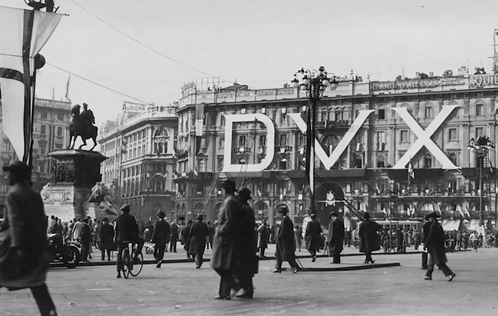
Palazzo Carminati during the Fascist period. Source: https://www.leparoleelecose.it/il-bosco-bianco-poesie-e-altri-scritti/

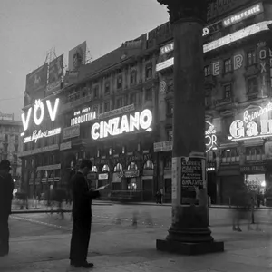
A man reads a newspaper beneath the neon lights of Palazzo Carminati. Source: Urban File
Between the 1950s and the 1990s, the façade of the building was populated by signs: full-scale neon advertising posters and logos adapted to flicker in what Bruno Munari aptly called «the fog of Milan». Among the many logos that, over the decades, alternated across the surface of Palazzo Carminati, illuminating Milanese nights like ghostly presences, some became particularly familiar to the eyes of residents: the bold – and therefore dazzling – Cinzano logotype, the hypnotic red spirals of Cora bitters, the silhouette of the Kores woman typing with carbon paper.
In 1999, under Mayor Albertini’s administration, the illuminated signs and flashing logos that had long occupied Piazza Duomo were dismantled from Palazzo Carminati, amid both discontent and enthusiasm, following a campaign in favour of urban decorum.
A few years after the disappearance of the illuminated signs from Piazza Duomo, between 2004 and 2012, Lawrence O’Toole launched the Ghost Sign Project blog, with the aim of mapping faded wall advertisements across the city of Philadelphia. The eroded signs documented by O’Toole reveal the persistence, within collective memory, of logotypes, lettering and slogans that remain vivid despite their material deterioration. With both the history of Palazzo Carminati and Crocenzi’s prophecies in mind, the Ghost Sign Project seems to speak directly to us: signs fade away, but their ghosts remain.

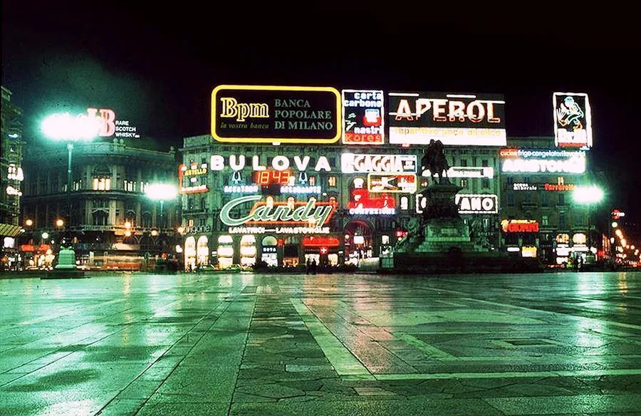
The neon lights of Piazza Duomo in the past. Source: Urban File
Among the neon ghosts that once inhabited Palazzo Carminati, one of the most memorable presences was the animated silhouette of a man in a suit admiring his freshly polished shoes: the mascot of Brill shoe polish, designed in the late 1920s and early 1930s for an advertising poster by Giorgio Muggiani – advertising artist and co-founder of Football Club Internazionale Milano in 1908. The anonymous man in a suit and wide-brimmed hat, delighting in the shine of his shoes, promoted – in the very heart of the city – a polish produced just six kilometres north of Piazza Duomo, in the Bovisa district.

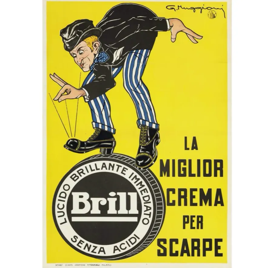
Brill shoe polish, produced at a factory in Bovisa.
BRILL AND THE OTHER LOGOS OF BOVISA
Bovisa, once an independent borgata, became part of Milan in 1873. Cut through by new railway lines pushing northwards, it was precisely in this period that the area began to leave behind its agricultural vocation – still evident in its name – and to embrace a new industrial identity. It was here, in a factory overlooking the tracks of the Ferrovie Nord in early twentieth-century Bovisa, that the Brill Shoe Polish Factory was established, taking over from the firm Parma & Landriani, which until shortly before had produced the Ecla shoe polish. Alongside its famous polish, Brill marketed floor and furniture waxes, insecticides, soaps and other chemical products.
In the area surrounding Brill, around 1880, the most advanced Italian chemical industry began to cluster. In Aura di Bovisa, a key volume for understanding the area’s industrial history, Giorgio Fiorese argues that it was in Bovisa that the national chemical industry was born. There is even a specific year: 1882, when the inauguration of the first large sulphuric acid plant of the company Giuseppe Candiani marked the beginning of a wave of industrial settlements, making north-west Milan the most important Italian hub in the sector for much of the twentieth century. Shortly before Brill’s arrival, industrial fertilisers under the Sessa Cantù brand, Sirio soaps, paints produced by Edoardo Piatti, pharmaceuticals by Carlo Erba, as well as Candiani chemical products, began to circulate on the market bearing the label Bovisa Milano.
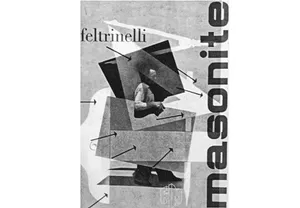
Over the decades, chemical production was joined by other industrial sectors, fuelled by lively commercial communication. Bovisa thus came to offer a direct account of the evolution of Italian graphic design: from the painterly poster art of Leopoldo Metlicovitz for the waterproof coverings of Ettore Moretti, to the geometric abstraction developed by Luigi Veronesi for the Vernici Italiane IVI company in the 1930s, through to the modernism of the photomontages produced by Albe Steiner for Lepetit pharmaceuticals, or by Max Huber for the industrial production of Feltrinelli Masonite wood panels. The posters pasted onto the walls of the city centre – the very ones Crocenzi referred to in his May 1945 article – increasingly bore the names of companies founded or based in the industrial district of Milan’s north-western suburbs.

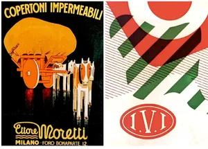
Immagini tratte dal volume Aura di Bovisa

Images taken from the volume Aura di Bovisa.
It was precisely within this industrial ferment that, in 1905, with the commissioning of a first monumental gasometer, the facility that would become the largest plant for gas production, distribution and by-product processing at a national scale was inaugurated by the Union des Gaz de Paris. At the beginning of the century, the city was experiencing a rapidly growing demand for gas, and the French company, using gaseous fuel produced through coal distillation, was able to guarantee increasingly widespread public lighting — which meant light in private homes and driving force for industry. The Officine Gas Bovisa became a true industrial citadel built around the gasometer, occupying most of the area enclosed by the railway tracks: on one side those of the Ferrovie Nord (Milan–Saronno), on the other those of the State Railways (Varesine). The railway lines thus ended up giving the plant a shape reminiscent of a gas flame. Over time, however, everyone began to call it «Goccia», preferring — ironically — the image of a liquid fluid to that of a gaseous one.
For much of the twentieth century, the Officine Gas Bovisa maintained their leading role in gas production and distribution, passing in 1920 to the Società Gas e Coke and in 1931 to Edison. It was only around the 1970s, with the spread of methane, that they experienced a first period of crisis. In the early 1980s, the Milan City Council decided to extend the remit of the Azienda Energetica Municipale — AEM, today A2A — and, with the aim of municipalising the gas service, took over ownership of the plant from Edison. By exploiting and expanding the underground network of gas and methane pipelines in order to «methanise» and «district-heat» the city, AEM transformed itself from an electricity company into a fully fledged energy utility. It is no coincidence that, to support this transformation, AEM turned to a graphic designer who knew the underground so well that he earned the nickname «the mole» among his colleagues: Bob Noorda.
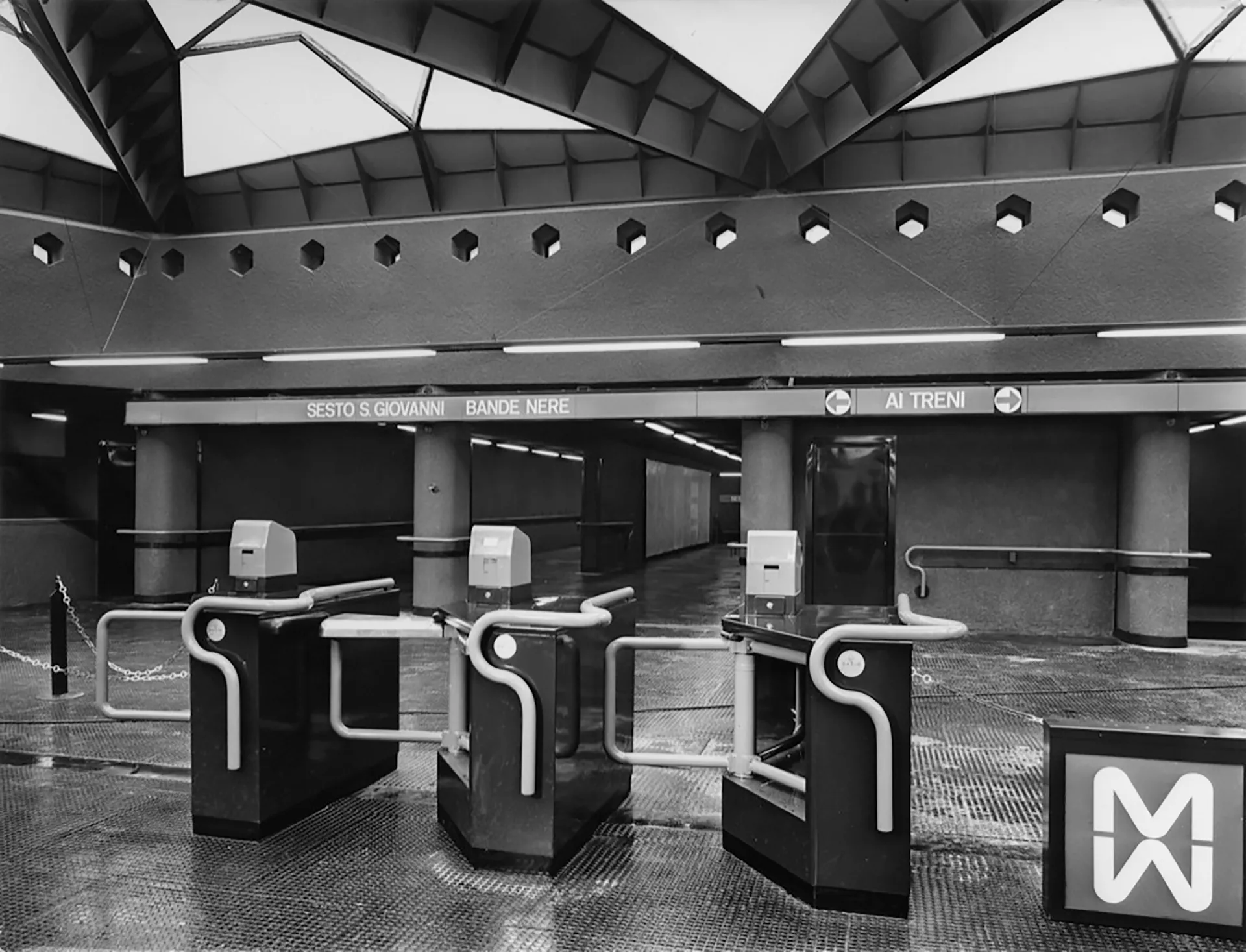
In truth, Noorda did not only know the «underground» world well; he was equally familiar with the lives of logos — their earthly death and their ghostly persistence in collective memory. Almost twenty years before being contacted by AEM, in the early 1960s, the Dutch-born designer, who had moved to Milan in 1954, began working with architects Franco Albiniand Franca Helg on the design of the visual identity and signage system for Milan’s first underground line, inaugurated in November 1964.The functionalist approach acquired during his formative years found application in numerous aspects of the project: the study of passenger flows allowed visual information to be placed at key junctions; station names repeated along the signage bands on platforms enabled users to easily identify their stop; the use of matte paint on signage panels increased legibility without reflecting light.
With this project, Noorda would go on to win the Compasso d’Oro, and in the year following the metro’s inauguration he founded the multinational studio Unimark International — together with, among others, Massimo Vignelli — becoming one of the leading figures of the golden age of corporate identity on a global scale, and also designing the signage systems for the underground networks of New York and São Paulo. It was precisely recalling this latter experience that he would later admit: «Entire weeks spent underground studying — my colleagues called me the mole»⑥. And yet, despite his success and experience, for the Milan underground Noorda designed a logo that lasted only as long as it took to be launched. The first logo for the Milan Metro, conceived between 1962 and 1963, consisted of two mirrored, overlapping «M»s, defined by a continuous line recalling the distinctive red handrail designed by Albini and Helg. The logo was used in early communications and in the signage of the trial installation at Amendola station, but was soon discarded: the inverted «M» at the bottom — which, through a delicate metaphor, represented life underground, an «upside-down» world — was read as a «W». For this reason, it was replaced by a double, side-by-side «M» with sharp angles, which remained in use until the 1980s.

Milan, MM Amendola–Fiera station. Source: https://it.wikipedia.org/wiki/File:Milano,_MM_Amendola-Fiera_03.jpg
Despite its premature disappearance, the original logo for the Milan underground has remained over the years a powerful ghostly presence within corporate identity manuals and histories of graphic design. It is often displayed in design museums and cherished by designers, yet never truly realised in the world outside theory and exhibition. A logo that seems to embody — also through its form, which subtly alludes to the underground and, in some way, to the otherworldly — the Fisherian concept of «hauntology», understood as the persistent presence in the present of elements from an interrupted or never fully realised past. Yet there is another logo by Noorda that may speak even more clearly of this present haunted by the past.
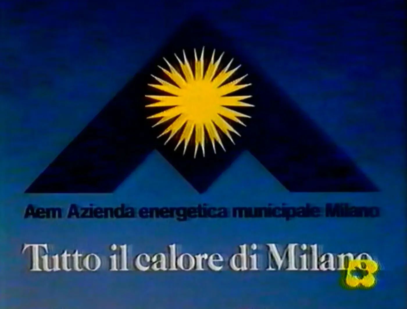
Two decades after the M1 project, Noorda was commissioned, as mentioned, to visually materialise the renewal of AEM. In the same years in which the Dutch designer was working — to name just a few — on the identity of the Touring Club Italiano, the image of Feltrinelli, of Coop and, within a strictly municipal context, of Amsa — in many cases with the contribution of Maurizio Minoggio⑦ — he also found himself signing the visual identity project that formalised the modernising vision of the new «energy plan for the Milan area». The final mark, presented in 1982, takes the form of a light-blue triangle within which an angular letter «M» appears to coexist with a radiant yellow sun at its centre⑧.

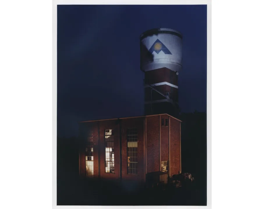
The AEM tower at the Goccia. Source: https://www.lombardiabeniculturali.it/fotografie/schede/IMM-3a010-0015469/
The visual metaphor of the sun as a primary source of energy also appears in an AEM television commercial from the mid-1980s, during the golden age of TV advertising — a period that in Lombardy experienced a remarkable boom, driven in part by the proliferation of local broadcasters. In the commercial, a group of technicians from the municipal utility arrive in the middle of the night not among the gasometers of the Bovisa industrial complex, but in Piazza Duomo. Using a crane, they lean out beyond the spires and the Madonnina, managing to activate a romantic pull-cord switch that turns on nothing less than the sun itself, flooding the city with daylight.

AEM. Source: https://www.spot80.tv/spot/aem-milano/
The sunlit «M» launched by AEM in the 1980s was also imprinted, in its official colours, onto the buildings of the Bovisa plant. It can still be seen today on the curved wall of a storage tower rising among the buildings and gasometers of the industrial complex. Indeed, Noorda’s mark is the only surviving commercial symbol from the site’s long industrial season, which over the years saw the closure of plants including Smeriglio, Montedison, and Ceretti & Tanfani. The tower bearing this sharp-edged «M» — whose form enigmatically recalls that of military stealth aircraft, zigzagging vehicles invisible to radar — can today be visited as a piece of industrial graphic archaeology within the forest of the Goccia: like a monolith fallen into a suspended, mutable and contaminated landscape. On 11 July 1994, AEM’s facilities were definitively shut down, and the site was designated a Sito di Interesse Nazionaledue to the high density of contaminants present in the soil.
LOGOS AS MONSTERS AND LEFTOVERS
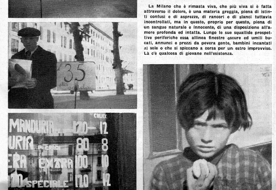
In the closing lines of his report on post-war Milan as a ghostly city, Crocenzi glimpses a narrow opening towards life. Not, of course, in the centre — inhabited, as described, by the ghosts of Fascism and the illusions of bourgeois consumerism — but rather in the «peripheral perspectives»⑨, populated by lines of hanging laundry, by notices and prices «for poor people, for children enchanted by the sun»⑩. In the suburbs, Crocenzi perceives life. There, he says, there is «something young»⑪.

Luigi Crocenzi, Occhio su Milano, Il Politecnico, no. 29, 1 May 1946.
Crocenzi’s words find a resonance in a volume recently edited by Annalisa Metta entitled Il paesaggio è un mostro. In the book, Metta explores the dialectic between the urban and the natural, moving beyond both “green” rhetoric and efficiency-driven planning. In one passage she writes: «wonder […] occurs when a project is able to become vacanza»⑫ — a word which, for the author, is «literally the condition of what is empty»⑬, vacant indeed, but also a «state of exception with respect to normality, to the habitual productive and determinative condition»⑭.
The industrial citadel of Milan’s Bovisa, following the closure of its plants in 1994, has also become a space of vacanza: a conflicted place, capable of generating «unimagined Frankenstein landscapes»⑮ — in other words, monsters born from the absence of economic and industrial planning, from interspecies entanglement, from the advance of flora and non-human fauna around the storage tower marked by the AEM logo. Noorda’s mark did not fade away, did not die; it was swallowed, mixed, regurgitated, and became something else.
In 1979, Enrico Castelnuovo and Carlo Ginzburg used the term scarto («discard») to describe phenomena that occurred far from canonical artistic centres in Italian painting between the sixteenth and eighteenth centuries⑯. This term, which in most cases carries a derogatory meaning, becomes in their counter-historical narrative a synonym for lateral movement, alternative to the dominant flow — an act of resistance and resilience. Borrowing this expression as well, we might say that while the centre is inhabited by ghosts, the forest of the Goccia is populated by monsters, by discards.
If in the 1970s it was crucial for architects to learn from the intermittent signs of Las Vegas, from neon logos that taught an unforeseen, vernacular, bottom-up way of designing, today there is something for designers, architects, administrators and citizens alike to learn from the forest of the Goccia.
Now that logos — which in the meantime we have learned to call brands — have returned to define skyscrapers in the city’s most exclusive areas; now that developers brand buildings themselves to sell them more effectively; now that Milan is increasingly tailored to tourists and boasts the most expensive luxury shopping street in the world; now that the city centre is once again infested with brands — the presence of a single logo on the storage tower at the heart of the Goccia, within a dense, resilient, living and unpredictable woodland, seems to confirm the dichotomy between centre and periphery, between ghosts and the living, glimpsed by Crocenzi in the immediate post-war years.
And perhaps this is precisely the mission of that wedge of uncultivated land in the heart of Bovisa that is the Goccia: to reveal life that emerges from the absence of planning and the exploitation of every square metre; from emptiness rather than fullness; from the lack of logos rather than their multiplication; from the monsters and discards of the suburbs rather than the ghosts of the centre.
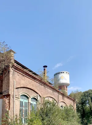
AEM tower at the Goccia. Photo: Michele Galluzzo, 2025.
NOTES
(1) Luigi Crocenzi, Occhio su Milano, Il Politecnico, no. 29, 1 May 1946, p. 14.
(2) Ibid., p. 13.
(3) Ibid., p. 14.
(4) He was responsible for the remarkable collective volume on Milan published in 1967, which brought together leading figures in photography such as Aldo Ballo, Diego Birelli, Mimmo Castellano, Cesare Colombo, Mario Cresci and Ferdinando Scianna. See Luigi Crocenzi & Diego Birelli (eds.), Milano, Electa, Milan, 1967.
(5) See Giorgio Fiorese, Aura di Bovisa: Produzione, conoscenza, figurazione, Maggioli Editore, Santarcangelo di Romagna (RN), 2022, p. 18.
(6) Bob Noorda, interviewed by Caterina Soffici, Bob Noorda: L’architetto dei marchi, Il Giornale, 1 September 2005, https://www.ilgiornale.it/news/bob-noorda-larchitetto-dei-marchi.html, last accessed: 8 December 2025.
(7) See Mario Piazza, Bob Noorda Design, 24 Ore Cultura, Milan, 2015.
(8) In the mid-1990s AEM was transformed into a joint-stock company, and in place of the sun at the centre of the «M» it was once again Noorda who designed a composition of nine shaded yellow circles arranged in a diamond shape, still visible today embossed on numerous manhole covers throughout the city.
(9) Luigi Crocenzi, Occhio su Milano, Il Politecnico, no. 29, 1 May 1946, p. 14.
(10) Ibid.
(11) Ibid.
(12) Annalisa Metta, Il paesaggio è un mostro: Città selvatiche e nature ibride, Derive e Approdi, Rome, 2022, p. 129.
(13) Ibid., p. 117.
(14) Ibid.
(15) Ibid., p. 9.
(16) Enrico Castelnuovo & Carlo Ginzburg, Centro e periferia nella storia dell’arte italiana, Officina Libraria, Rome, 2019, p. 116.
Michele Galluzzo. Michele Galluzzo è un graphic designer e ricercatore. Dopo una laurea in Scienze della comunicazione (Università del Salento) e un master in grafica editoriale (ISIA di Urbino), nel 2018 completa il dottorato in Scienze del Design (IUAV di Venezia). Dal 2014 al 2017 è assistente di ricerca e graphic designer presso l’Archivio Storico del Progetto Grafico AIAP CDPG di Milano. Come ricercatore ha collaborato con diversi archivi storici, tra i quali Associazione Archivio Storico Olivetti, Fondazione Pirelli, Gruppo Campari. Dal 2018 al 2022 è parte della redazione della rivista internazionale di grafica Progetto Grafico. Nel 2020 fonda con Franziska Weitgruber il duo di design/ricerca Fantasia Type. Dal 2020 al 2023 è RTD nella Facoltà di Design e Arti della Libera Università di Bolzano e e attualmente insegna presso l’Accademia Abadir di Catania, lo IUAV di Venezia, la Libera Università di Bolzano e la Raffles Milano. Nel 2024 ha pubblicato per Krisis Publishing il libro Logo In Real Life: Note per una storia sociale della visual identity.